Our resident photography expert Rob from redwood photography shares some of the band promo pics that have recently caught his eye.
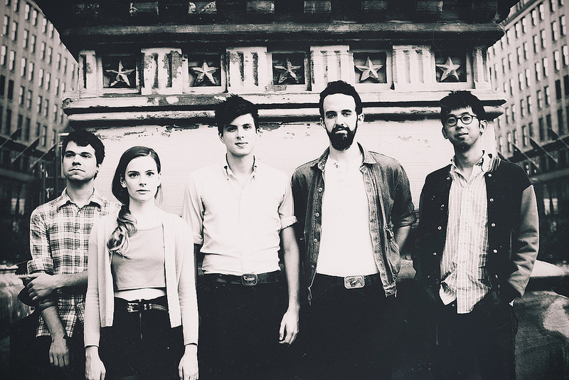
I’m a newly acquired fan of Macclesfield rockers The Virgin Mary’s following the release of their debut album, and on their site they’ve got a nice set of press images taken by the phenomenal Ray Lego. This one in particular stood out for me. It’s a simple idea, but the subjects themselves, the way they’ve been lit from the front (the light is above camera, notice the shadow underneath the front-man’s chin), the wide-angle perspective, and the post-processing all work together to create an intensity in the image that fits well with their brand. I really like it. I look at a lot of band photographs, and simple well-executed ideas always stand out…
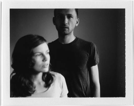
Whilst we’re speaking about ‘simple’, I wanted to call out this image that RCM regulars amongst amongst you will recognise as being Houses who featured on the blog a couple of weeks ago. Sure, it looks like it’s been taken on a phone, and then spewed out of some kind of instagram-type app to create a little black and white type print type-thing….that’s not the point. The point is that when I scanned through all the thumbnails from recent RCM articles, this one immediately jumped out at me. Why? Two words…..Interesting Light. If you want to create an interesting image, the first place to start is get some interesting light. In this one it’s as simple as having a window to the right of the subjects – the girl is looking out of it, and the guy is standing slightly away so the light is falling off him and creating great shadows. Probably the cheapest image you could take, but it made me want to find out more about who they were (and that’s the point of your images right?).

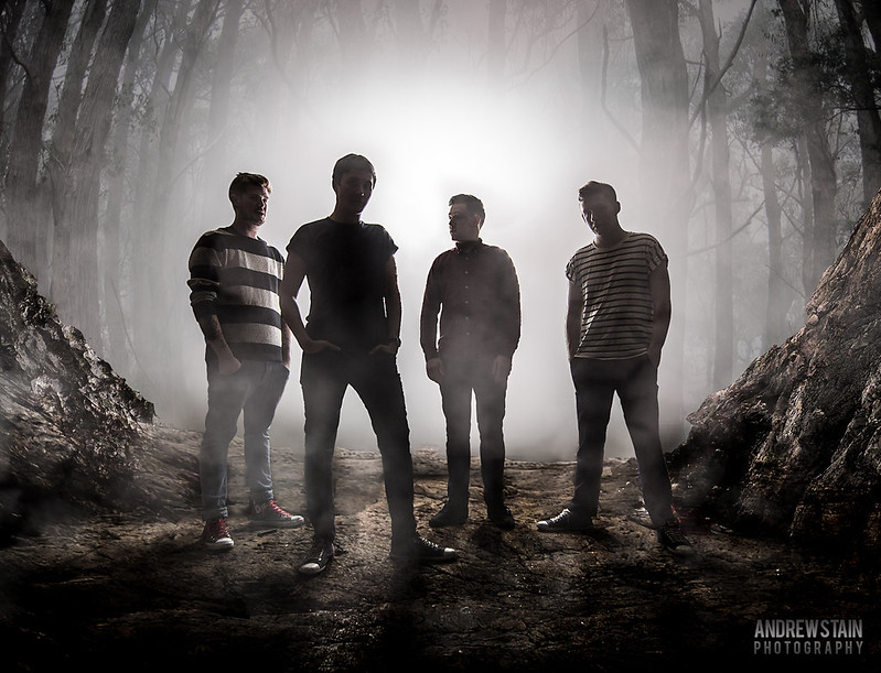
Sometimes you have to work harder to create interesting light. For this shot of Only Shadows, photographer and Photoshop-ninja Andrew Stain used two off-camera flashes positioned behind the band and facing into a roller shutter door that they were standing in front of. This created a really strong backlit image, leaving the band almost silhouetted for a mysterious and moody type image. He then created the whole environment around them (smoke included) using Photoshop. It’s an awesome piece of work. (A word of warning…Photoshop gives you a ton of creativity options, but if you’re interested in pushing the boundaries with composite images make sure you’re working with someone like Andrew who knows how to do it, ‘cos if they’re not done well they can really suck!)
So there you go…hopefully this has given you some more ideas and inspiration for your own band photos. Remember, very often folks will see your images before they hear your music, so your images need to be just as good as your songwriting!
And if you’d rather focus on looking ‘uber-cool’ and let someone else worry about the technicalities of getting the shot right, then feel free to get in touch.


